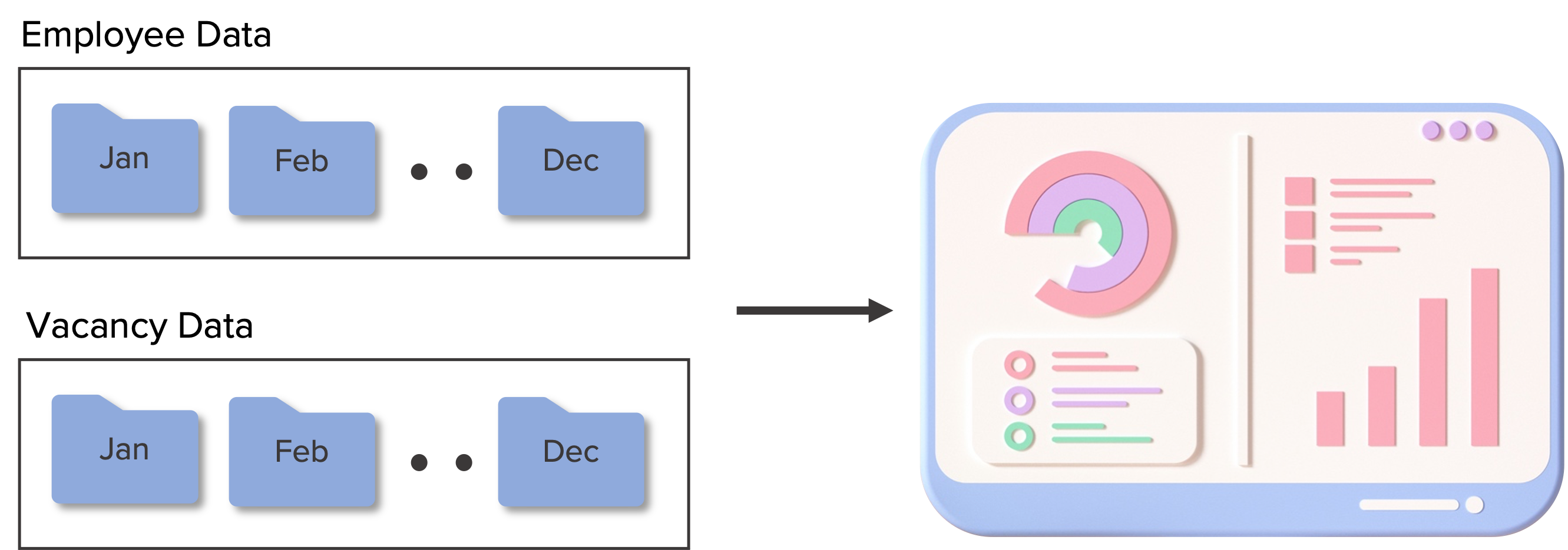
In my previous posts, I shared how I created a dataset of two data sources - one from Microsoft examples and another from a generated data source.
I created a dashboard to visualize this data using Power BI. You can see the report in action here in the Power BI Data Stories gallery.
This detailed dashboard has a summary page to cater to a high level overview on HR KPIs, and three other pages to elaborate on key areas- headcount, turnover and recruitment.
Data Model for the dashboard
This will enable the HR team to obtain key metrics quickly, get a detailed view into how different metrics perform and decide on areas for improvement.